
Closed loop / open mind
In a world where most packaging is designed to disappear, this series makes it visible—on purpose.
Closed Loop/Open Mind celebrates the companies leading the shift toward smarter, more circular shipping systems. Each piece is made from single-use cardboard that was destined for the bin, then reworked into something lasting: a visual story of reinvention, responsibility, and design thinking.
These works don’t just critique waste—they highlight progress. From redesigned boxes to return-ready materials to systems that use less and last longer, this series gives form to the efforts that often go unnoticed.
Because when companies think beyond the landfill, they open space for innovation. For leadership. For something better than “good enough.”
This is what that looks like.

break through
18" x 20" | Acrylic on reclaimed shipping cardboard boxes
At first glance, it looks like a wall. But this piece is about what happens when walls come down.
Made from single-use cardboard and layered with bright, stenciled bricks, Built to Break Through reflects the systems we’ve inherited: structured, familiar, and ready for change. Each painted “brick” is a nod to what once felt immovable—outdated packaging, wasteful defaults, linear design.
And yet here it is: color, texture, possibility. The wall becomes pattern. The pattern becomes story. And the story becomes progress.
This piece honors the companies breaking through the old way of doing things—those replacing throwaway culture with circular thinking, and legacy systems with real solutions. Because sustainability isn’t a barrier—it’s a door. And it’s already open.

oxidation point
9"x 25" | Acrylic on reclaimed shipping cardboard boxes
Rust doesn’t happen overnight. It takes time. Exposure. Contact with the elements. So does real change.
Oxidation Point is built from torn, furled layers of reclaimed cardboard—painted in rust tones that evoke oxidation, erosion, and endurance. Set against a field of blue, the jagged forms feel like remnants. But they aren’t ruins. They’re records.
This piece honors the brands doing the hard work of transformation—not with a fresh coat of paint, but by staying in the process long enough to evolve. What once was discard becomes design. What once signaled breakdown now speaks to resolve.
Because rust doesn’t mean weakness. It means something has weathered the storm—and stayed.

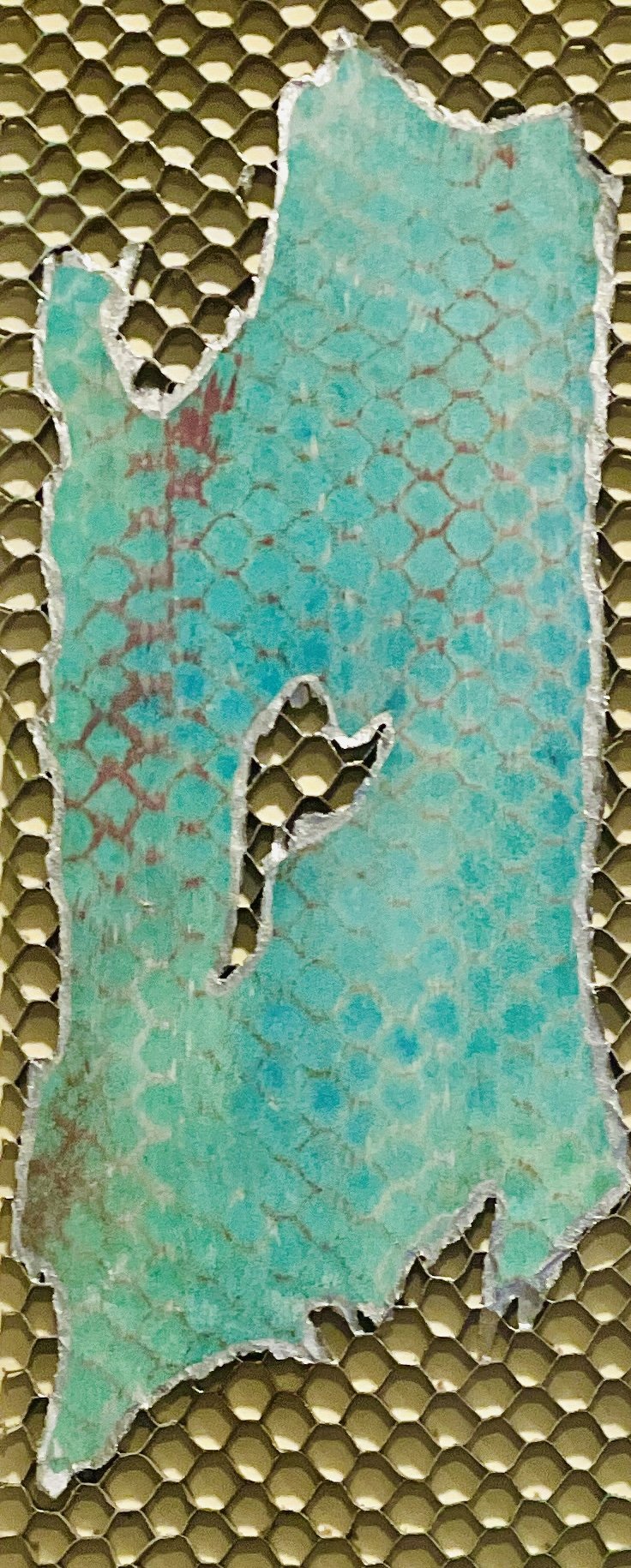
strength in the structure
21" x 26" | Acrylic on reclaimed honeycomb shipping cardboard, metallic accents, mounted on wood
Colorful. Confident. Built to last.
Strength in the Structure is layered in vibrant teal and purple—bold on the surface, and even more impressive underneath. Where the cardboard tears, the honeycomb core is exposed: engineered for strength, designed for efficiency, and often overlooked.
That’s the point.
This piece celebrates what great companies build into their systems: light-touch materials that carry real weight, beauty backed by substance, and design choices that make sustainability second nature.
The exposed cells aren’t flaws—they’re features. They speak to transparency, trust, and leadership that isn’t afraid to show what’s working.
For brands investing in smarter packaging and better systems, this piece is more than art. It’s a visual expression of how good design feels: strong, vibrant, and ready for what’s next.
High end low impact
12" x 33" | Acrylic on reclaimed honeycomb shipping cardboard, metallic accents, mounted on wood
It looks like a luxury object—sleek, structured, tactile. But the truth is even better: it’s made from single-use honeycomb cardboard, the kind designed to protect and disappear. Here, it’s been reworked into something that commands attention.
With its shimmering teal surface and metallic edging, High-End Low-Impact plays with expectations. What once held value quietly—inside packaging—is now the main attraction.
This piece honors the brands designing with intention. Those proving that sustainability doesn’t mean compromise, and that beauty can come from anywhere—even the discard bin.
The smartest design doesn’t just look good. It lasts, it leads, and it leaves nothing behind.

I CAN BUY MYSELF FLOWERS (I)
33" x 54" | Acrylic on reclaimed cardboard shipping boxes
A riot of red. A surge of purple. This piece doesn’t ask permission—it arrives.
Full of power, joy, and unapologetic color, it’s a reminder that you don’t need anyone to show up with a bouquet. You already have the authority, the beauty, and the fire.
Buy yourself the flowers. Because you can. Because you deserve to see your power blooming on the wall, every single day.
This is what self-celebration looks like—loud, vibrant, and entirely on your terms.

I CAN BUY MYSELF FLOWERS (II)
21" x 23" | Acrylic on reclaimed cardboard shipping box mounted on wood
No waiting. No permission. No special occasion required.
This piece is a declaration of self-celebration—a reminder that beauty, joy, and boldness don’t need to be gifted. They can be claimed.
These flowers aren’t delicate. They’re layered, assertive, and entirely on your terms. Every petal and brushstroke says: you are allowed to take up space, to feel like a celebration, anytime you damn well please.
Hang it like a bouquet that never wilts. A reminder that showing up for yourself is more than enough.